
What is Op Art?
The 1960s were a tumultuous period in American history. Long disregarded questions of racial inequality raised during Reconstruction came to a head; the carnage and questionable ethics of the Vietnam War unfolded on television sets across the nation; and multiple assassinations rocked the collective American consciousness. By the 1960s, fantasies of America's prosperity and cultural unity that arose in the 1950's had shattered. And amidst the chaos of America's cultural upheaval, a new art movement blossomed: op art.

Characterized by simple shapes, forms, and colors arranged to induce the illusion of movement, op art (short for optical art) came into its own in 1965 with the debut of The Responsive Eye at the Museum of Modern Art in New York City (MoMA). As the exhibition title suggests, The Responsive Eye focused on viewers' perceptual reactions to art rather than art as an objective object.
“Unlike most previous abstract painting, these works exist less as objects to be examined than as generators of perceptual responses, of colors and relationships existing solely in vision…" - William Seitz, MoMA Curator of Painting and Sculpture, 1960-1970.
Touted as "...a new phase in the grammar of art," the works included in The Responsive Eye polarized audiences, with some praising the dizzying images for their theoretical implications and others dismissing the works as gimmicks.
Perhaps because of the controversy it generated, The Responsive Eye was a success; It restarted the age-old conversation about a subjective viewer's relationship to art and introduced the general public to some of the most influential artists of the 20th century, including Ellsworth Kelly, Richard Anuszkiewicz, and most importantly, Josef Albers.
Who Invented Op Art?
Although no one person invented op art, critics and art historians often credit Josef Albers with galvanizing the movement.
Known today as one of the most influential artists and art educators of the 20th century, Josef Albers showed no early signs of artistic genius, although he did exhibit his parents' natural talent for craftsmanship from a young age. Despite his knack for craft, Albers didn't enter the trades. At 20, he began what would become a lifelong career in education. After five years of teaching in Bottrop, Westphalia, Germany, Albers moved to Berlin to study art education, which would later snowball into a fruitful career as an artist, color theorist, and educator.
By 1925, Albers was a professor at the infamous Bauhaus, a highly influential German art school dedicated to marrying craftwork with fine art. But the Nazi Party's rise to power cut short Albers' career in the German art education world. Facing increasing pressure from the Nazis for his modernist views, Albers emigrated to America, where he became the faculty head of painting at Black Mountain College in North Carolina.
Albers' artistic philosophy and disciplined approach to design were well-formed when he reached America in 1933. His minimalist design aesthetic, paired with his revolutionary color theories, influenced numerous Black Mountain College alumni, including Robert Rauschenberg, Cy Twombly, and Susan Weil, and helped lay the foundation for the op art movement.
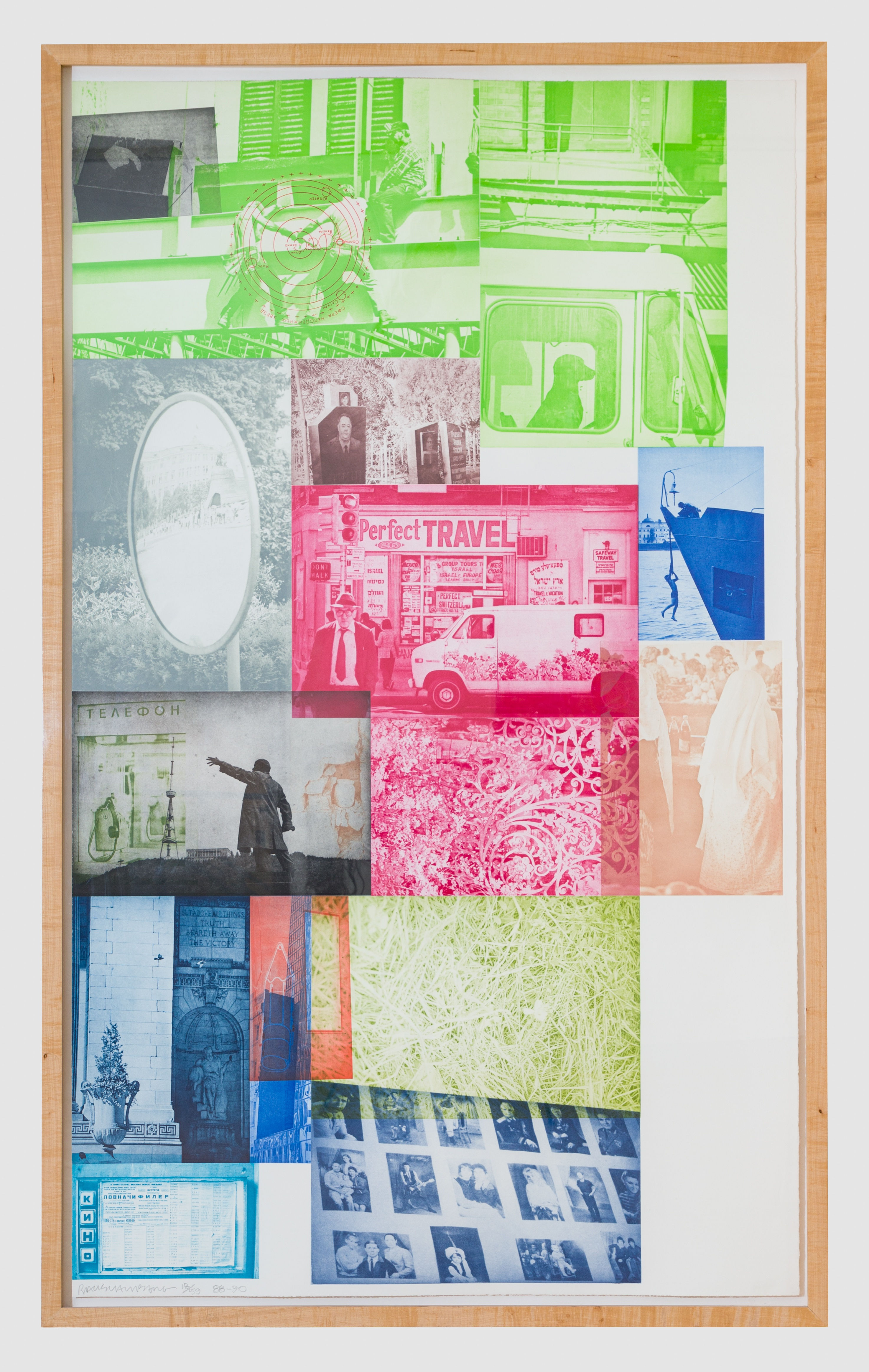
Soviet/ American Array VI, 1991, Robert Rauschenberg
After a fruitful and influential career at Black Mountain College, Albers became the head of Yale's graphic design program. From 1950 to 1958, Albers taught a new generation of artists and designers about the codependent relationship of color, shapes, and forms, which led to the development of a new visual language of simplicity and tension best demonstrated by Albers' series Homage to the Square.

An example of a work from Homage to the Square by Josef Albers.
Though clinical in appearance, the works in Homage to the Square are actually intimate experiential studies of color relationships. But what, you may ask, does that mean?
Consider the colors of a winter scene. Although colors such as white, gray, and black exist objectively as abstract qualities, human perception makes the experience of color subjective. Or, as Albers put it when he first began his Homage to the Square series, "Every perception of color is an illusion...we do not see colors as they really are. In our perception they alter one another."
For Albers, the human response to color isn't an empirical phenomenon; It is influenced by context, composition, and forms.
We are all familiar with the feeling of a dull gray January scene, but why do we experience any emotional reaction at all? Why does a lone, dormant tree amidst a field of snow feel sad? This internal response to color and composition is what Albers set out to explore in his paintings.
Albers' theory of color and artistic philosophy inspired contemporary artists to explore the human relationship to color, line, and form. Under Albers' philosophy, the fundamental elements of artistic composition became new subjects for artists to explore. From Ellsworth Kelly's bold color blocks to Richard Anuszkiewicz's vibrational spectrums, Albers' influence on modern and postmodern artists is impossible to ignore.

Blue/Red-Orange/Green, 1970-71, Ellsworth Kelly
Op Art’s Decline
Unfortunately, it didn't take long for op art's buzz to make its way into advertising vernacular. Novel optical illusions painstakingly crafted by artisans were swifly co-opted in kitschy marketing visuals to appeal to the counter-culture sensibilities of a disillusioned 1960s American public.
By the time Albers died in March 1976, commercial outlets had appropriated many op art elements to create mass-market designs. As op art became more and more mainstream, many of the movement's founding artists, such as Anuszkiewicz, defected.
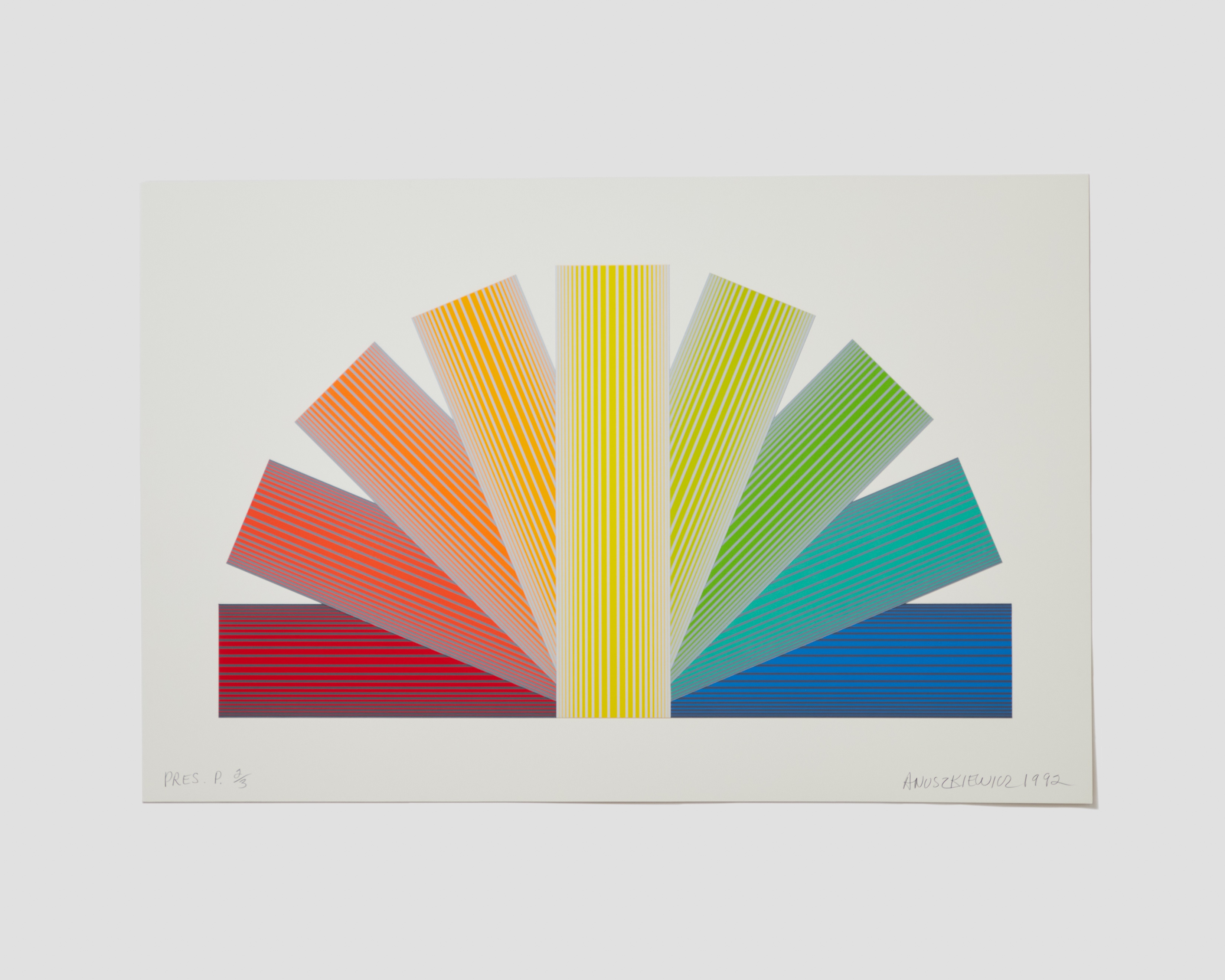
Grey Tinted Rainbow, 1991, Richard Anuszkiewicz
Albers' Legacy
While the peak of op art's popularity has passed, the movement's considerable ripple effect and Albers' influence remains visible in contemporary art.
Known internationally for her "fallen paintings," contemporary artist Polly Apfelbaum continues to play with the color theories first popularized by Albers in works such as Rainbow Love Mountain Ranch, New Mexico, where playful shapes comingle with saturated hues, evoking a sense of euphoria.
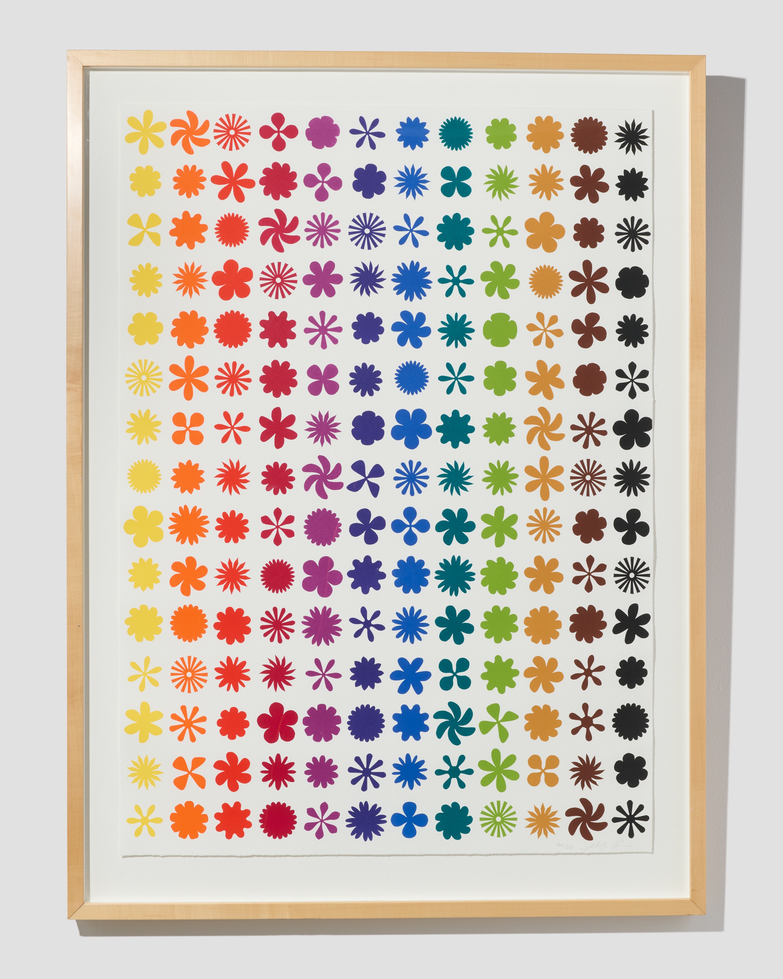
Rainbow Love Mountain Ranch, New Mexico, 2007, Polly Apfelbaum
Rainbow Love Mountain Ranch, New Mexico, is an orderly abstraction of shape and color. But upon closer examination, the work becomes more than a twelve-color lithograph; it is a transcendent visual and emotional experience. Its organic shapes come alive, humming with an energy that matches the composition's vibrant colors. Our eyes wander over and into the artwork — we are, in a sense, confronted with two conflicting truths of objective reality and perceived reality. The work flickers from a fixed object to a party of colorful, dancing shapes. And this conflict, this tension between existence and experience, is op art's most emphatic line of inquiry. Is reality concrete or abstract? Does the mind manufacture reality? Or does it exist externally?
For a possible answer to these philosophical questions, we can look to the man who dedicated his life to art and color theory:
“For me, abstraction is real, probably more real than nature. I'll go further and say that abstraction is nearer my heart. I prefer to see with closed eyes.” – Josef Albers, 1888-1976.


