
The artist himself, Matt Magee.
Spencer Linford: Hi, Matt! Getting right into it, your latest exhibition, Black and White, is equal parts travelogue and inquiry into the practice of asemic writing. Could you share your interest in asemic writing and how it relates to your broader process?
Matt Magee: The title was inspired by a 2014 Josef Albers show with the same title, Black and White, at Waddington Custot. Albers used black to inform his knowledge and understanding of color. While monochrome prints, sculptures, and paintings predominate in my practice, currently, a more important theoretical underpinning to it is the idea of language, specifically asemic writing. Asemic writing is a wordless, open semantic form of writing. The word asemic means, "having no specific semantic content," or “without the smallest unit of meaning.” With the non-specificity of asemic writing, a vacuum of meaning opens, which viewers fill in with their interpretations. Since the beginning of my practice in the late 1970s, there‘s been an interest in lining up forms, placing them in rows, and itemizing them. Oftentimes, I begin compositions at the top left of a panel and complete them at the lower right as if writing a paragraph. I would say that I absorbed this inclination from my father, who made a career as a geologist and mathematician. In the last few years, I realized there is an undefined and open-ended language implicit in my work that can be defined as asemic writing.

MATT MAGEE | Madrigal 1, 2019. Lithograph on BFK Rives vellum 270g, 38 x 26.75 in (96.5 x 67.9 cm), framed. Inspired by the caulking residue of a decaying church ceiling in Alabama, the Madrigal series is one of the most overtly asemic compositions in Magee's oeuvre so far.
SL: Although this exhibition predominantly comprises prints, there are two wall hangings in the show, Carbon and Glacier 2, made from repurposed plastic detergent bottles. Could you describe what led you to choose this material for these works, and explain how this material choice speaks to our current ecological moment?
MM: In 1983, during an internship at the Peggy Guggenheim Collection in Venice, I noticed all the trash and plastic bottles floating in the city canals. I began fishing out the bottles, as many as I could, especially the aqua-green and blue ones. In the evenings and on the weekends, I cut up the bottles and made small sculptures. I felt a responsibility somehow to help clean up the canals, but I also liked the accessibility to the free art supplies, albeit non-traditional ones. Throughout the 1970s, I collected rocks, minerals, arrowheads, seashells, etc. with my Dad on field trips. Through that, I developed an inclination to collect, amass, line up, and compare and contrast, almost in a scientific way. I created Carbon and Glacier 2 specifically for the show from black and white detergent bottles. Glacier 2 references melting glaciers and microplastics, residues that go on to pollute river systems and are ingested by aquatic creatures. Carbon references the manufacture of plastics, which is highly carbon intensive, meaning a significant amount of carbon dioxide is released into the atmosphere during the production process.

MATT MAGEE | Carbon, 2024. Plastic detergent bottles, wire, steel rod, 48 x 19 in
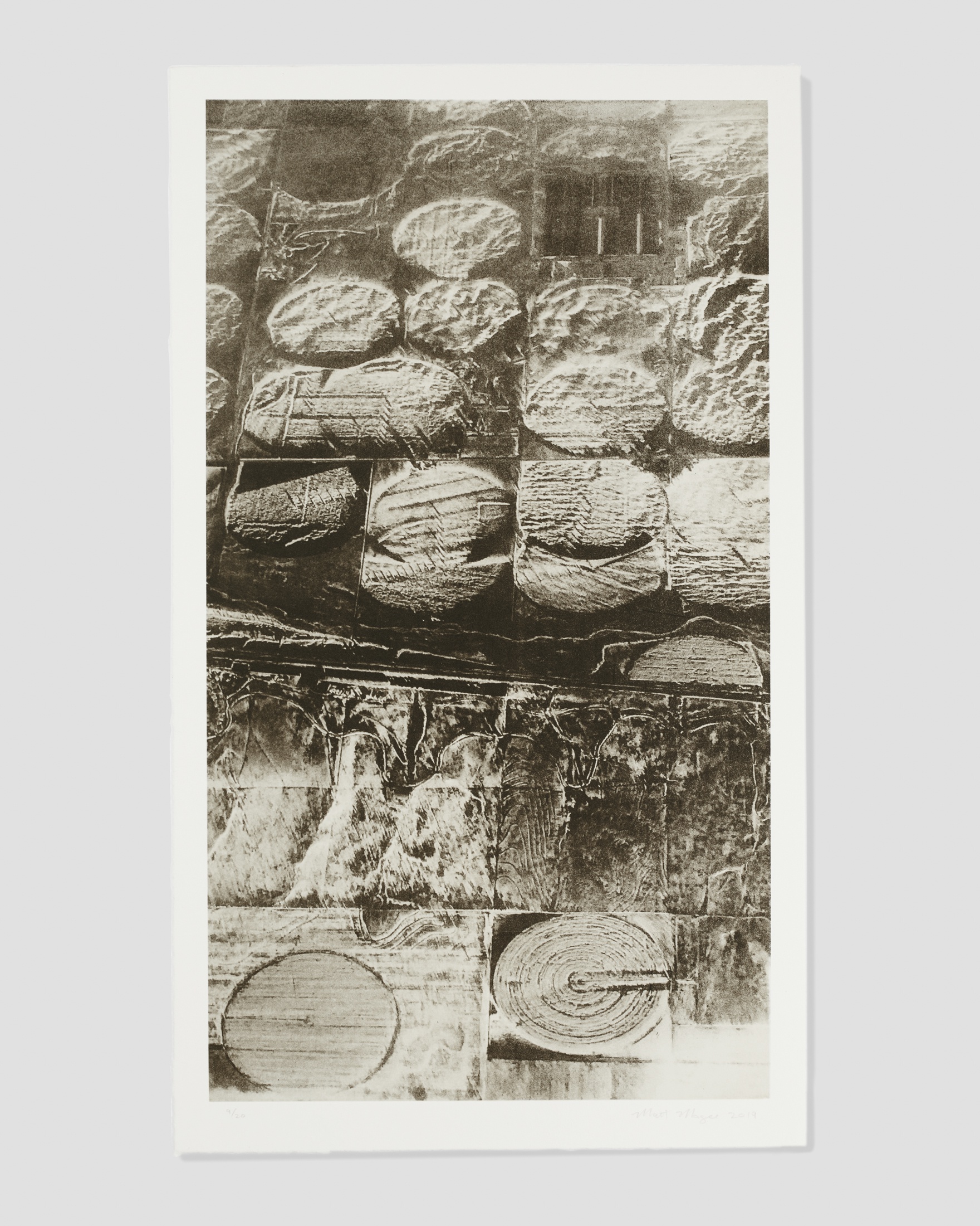
SL: Exploring land and place is important to many of the prints in this show, as they were printed in different publishing houses across the US and abroad. Speaking specifically of the Topologie series, could you share what it was like to produce these prints with one of France’s most highly regarded master printers, Michael Woolworth?
MM: I showed Michael Woolworth the aerial photos of the Topologie series and he was immediately taken with their graphic nature. Our collaboration began about a year after we first met in Paris through an introduction made by a mutual friend in the print world. I was keen to work in Paris, the city of my birth, and have access to the museums and galleries there. The photographs used for the Topologies were taken from an airplane window over the midwestern U.S. on a snowy day. Printed as photogravures, they become timeless and iconographic, and could be anyplace/anywhere. When I was born in Paris in 1961, my father was working as a senior petroleum geologist for an oil company and was involved in oil exploration of sub-Saharan Africa. This exploration involved taking low elevation flights over landscape to observe topographic and topologic features that might indicate the presence of oil and gas. This memory and idea also informs the Topologies.
SL: Your work is full of art historical references. In this exhibition, Bugs provides a glimpse into your artistic influences. Can you share with us what work, artist, or artist oeuvre Bugs is in dialogue with? And what effect, in your opinion, does this dialogue have on the experience of Black and White?
MM: The mid-twentieth century artist Myron Stout has long been an important touchstone in my practice. The abstraction, geometry, simplicity, and clean edges of his compositions resonate with, and are inspired by, and relative to, Cycladic figurines from c. 3300 to 1100 BCE. Bugs is a fairly direct reference to one of Stout’s charcoal drawings, though I’ve added compositional elements that tilt and animate the format, as if to nod to Stout. Bugs is part of a triptych of aquatints titled Plugs Bugs Drugs produced with Manneken Press that riffs on various print edition titles by Ed Ruscha. The multivalent art historical references provide a springboard for interpretations of other works in the show. Although the imagery of the prints and sculptures is entirely in black and white, the layers of inspiration are vibrant and rich.

SL: Finally, you’re one of the most hardworking artists I know. What are some of your forthcoming projects, and what is the best way for people to stay connected with you and your practice?
MM: My print work is featured at IFPDA at the Park Avenue Armory in NYC and the new Brooklyn Fine Art Print Fair at Power House in late March 2025. I am a part of a group show titled viewshed opening at the Black Mountain College Museum in Asheville, NC, on April 4 and that runs until August 16. I have a mural project this summer on the west side of Manhattan in Chelsea adjacent to the High Line. I'll also be completing four ongoing prints with Panik Art Studio in Mexico City this summer. I’m doing another residency at Tamarind Institute in Albuquerque in late 2025 and a solo show in Tucson in 2026. I have a print residency in Helsinki in June 2026, and I’ll be completing and beginning various prints with Woolworth in Paris in 2026, too. I'm also part of a group show at the Scottsdale Museum of Contemporary Art, This Just In…Recent Acquisitions @smoca (8 March – 7 September 2025).

SL: I think you've proved my point, Matt. You are easily one of the most hardworking artists I know. To keep up with Matt's blistering work ethic, check him out on Instagram, @matt7magee, or see all available works by Matt Magee here.

MATT MAGEE | Fact 2, 2024. Lithograph, 20.125 x 16.625 in (51.1 x 42.2 cm)
All photography by Marylene Mey, courtesy of Zane Bennett Contemporary Art
